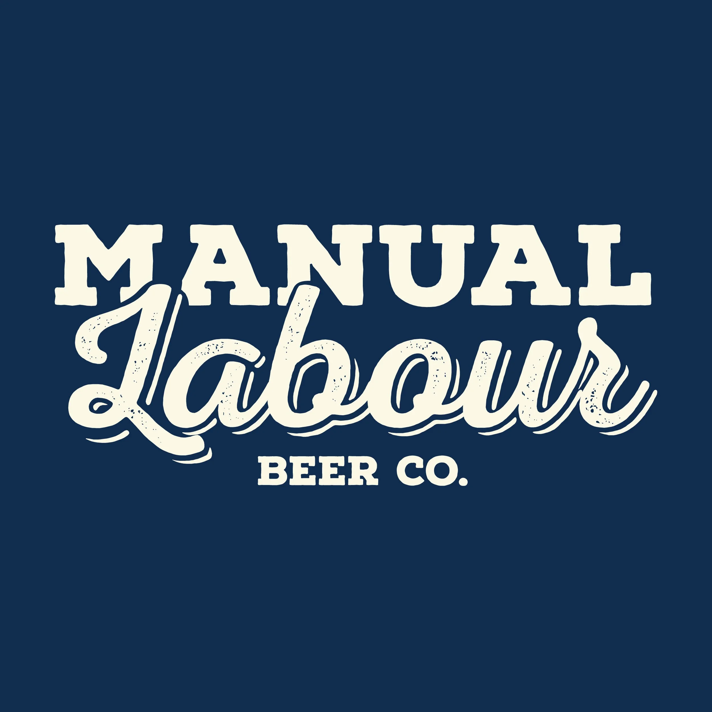
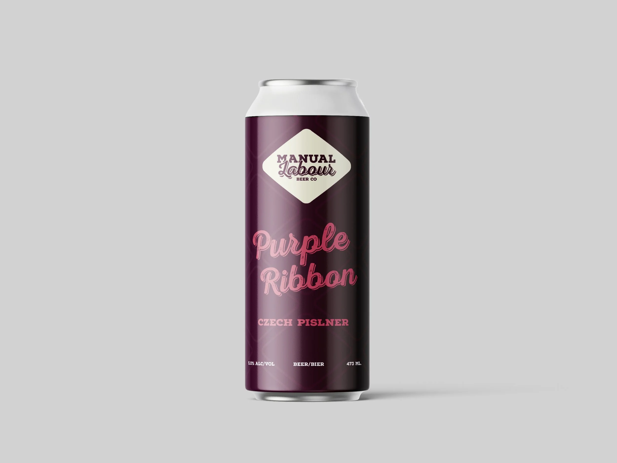
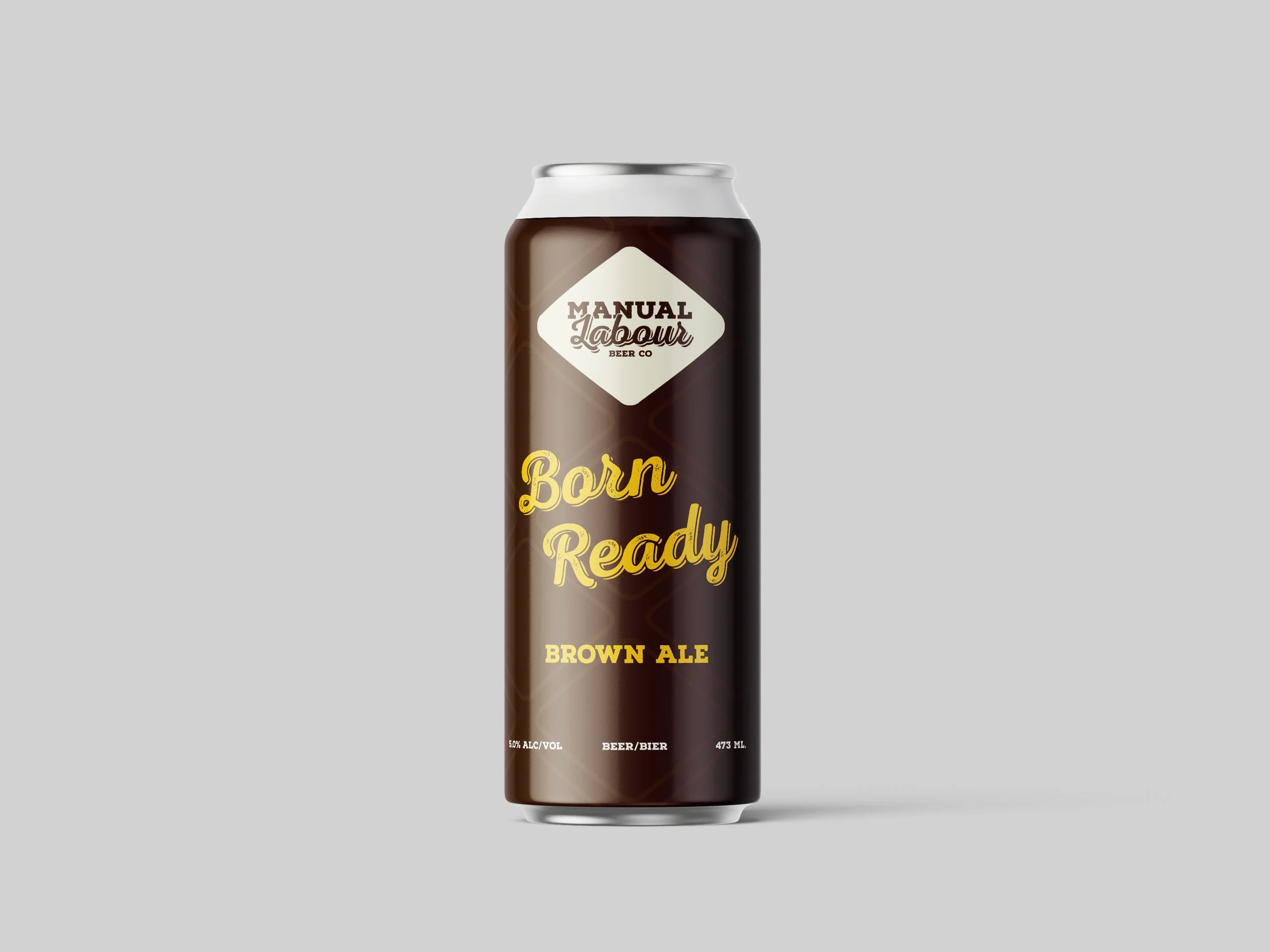
Manual Labour
Beer Co. Rebrand.
This rebrand focuses on creating a more cohesive and connected identity, grounded in a friendly, inclusive tone. The goal was to position the brewery as an inviting third space: somewhere people can gather, build community, and unwind over a beer.
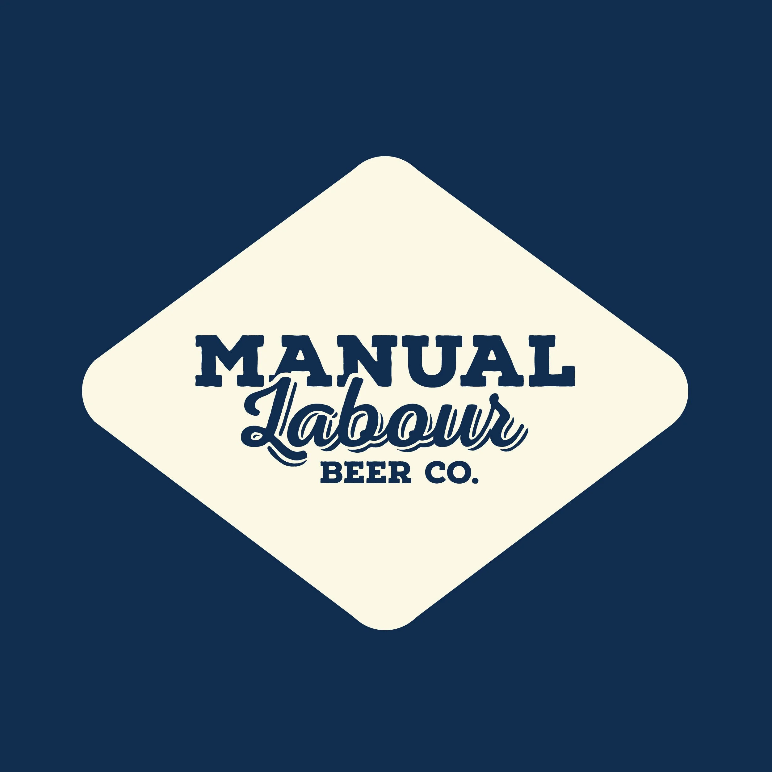
The logo features the brewery’s name set within a rounded diamond shape, inspired by construction signage. This visual reference ties directly to the brand’s name and reinforces its core values: celebrating and rewarding everyday people with a well-earned beer after a hard day’s work.
Client: School Project
Year: 2025
Services: Branding